Demonstration of the Functions
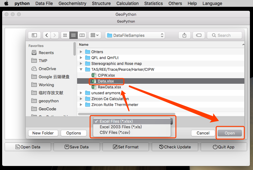
Open and Import Data
To start a plot or calculation, raw data file should be imported to GeoPyTool first.

The Data file can be Xlsx/Xls or CSV, For Windows User, Please use CSV with UTF-8 code without BOM. An NAN problem seems like to be caused by the different behavior of Pandas, used to import data sheet, on Windows it generate a lot of NAN, which didn't happen on Linux or macOS. So, at the moment, the data sheet should better be CSV coded with UTF-8 without BOM.
Data Unit
Unit of Oxide Items (such as SiO2, TiO2, Al2O3, Fe2O3, FeO, MnO, MgO, CaO Na2O, K2O, P2O5, LOI, Total, etc )is weight percent (wt%).
But Make Sure to follow the format in data templates.
Do not contain the % in the used data files!
Unit of other Elements Items (such as Li, Be, Sc, V, Cr, Co, Ni, Cu, Zn, Ga, Rb, Sr, Y, Zr, Nb, Cs, Ba, La, Ce, Pr, Nd, Sm, Eu, Gd, Tb, Dy, Ho, Er, Tm, Yb, Lu, Hf, Ta, Tl, Pb, Th, U) is ppm.
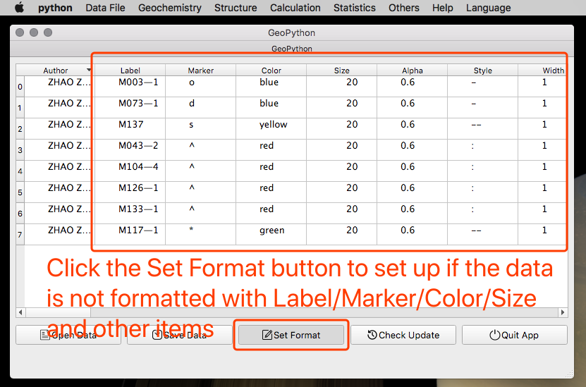
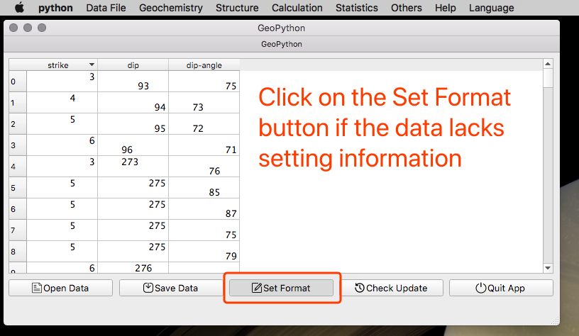
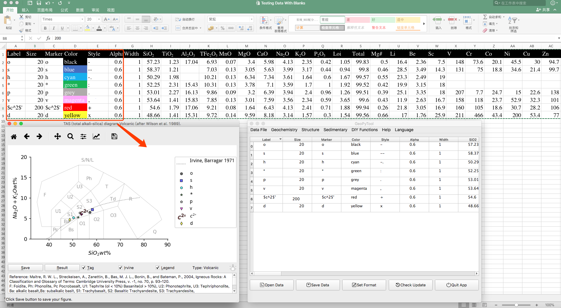
Set Up Data
If there is no setting up information such as the Label/Color/Marker/Style/Alpha/Width, you need to click on the Set Format button to add these items and make modification by yourself.
Data Setting Details
As shown in the Data File Samples, all data files contain the following Items:
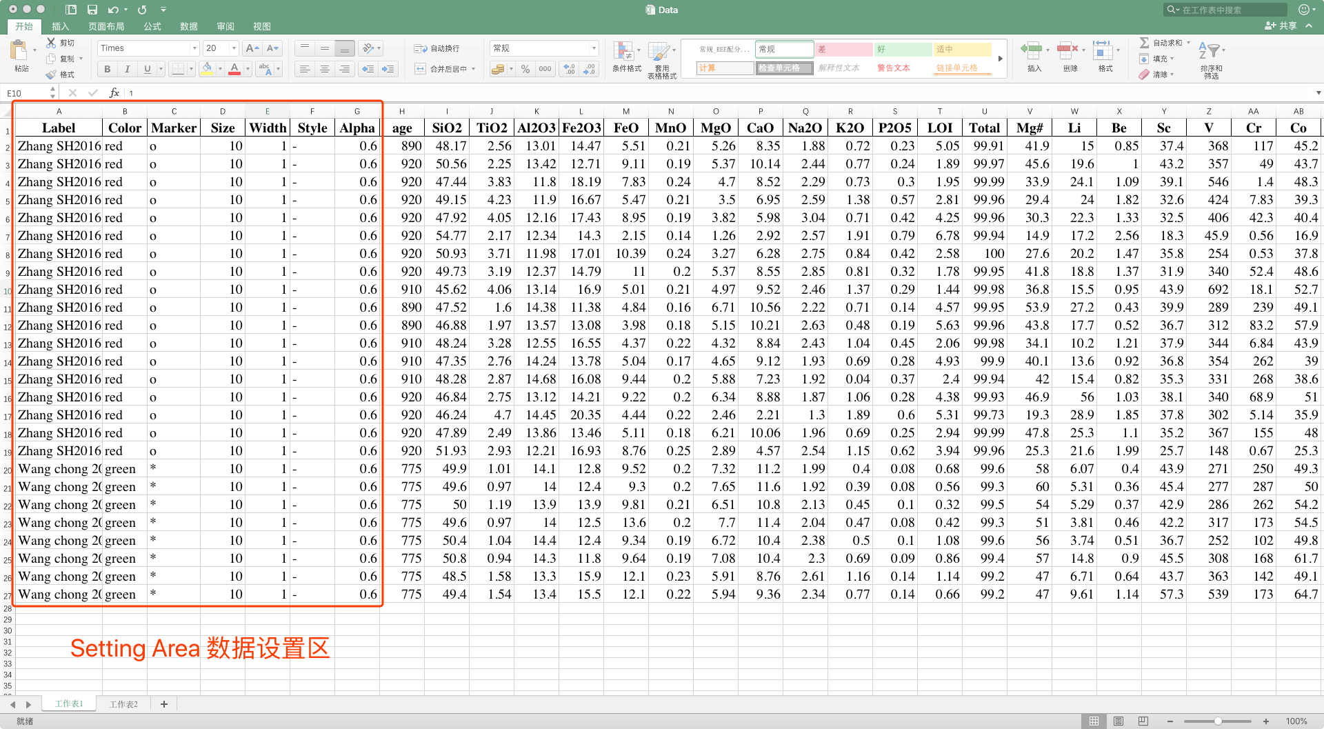
Label: control the group of sample and will be shown on legendColor: control theColorof both drawn line and plotted pointMarker: control the points shapeSize: control the pointsSizeWidth: control the lineWidthStyle: control the line shapeAlpha: control the transparency of both drawn line and plotted point
Besides these seven items, the other columns in your data MUST ALL be number values!
Label can be set to any character,word or phrase.
Color can only be chosen from following words: 'blue','green','red','cyan','magenta','yellow','black','white'.
Color:

Size, Width, and Alpha
These three are number values. The unit used for Size and Width is pt. Size normally should be larger than '10', and Width usually is '1'. Alpha can be set from '0' to '1', for example, setting Alpha as '0.4' means 40% transparency.
Marker and Style
these two are slightly more complicated and can be set as the contents of the following lists.
Marker :

Style:

The effect of setting:
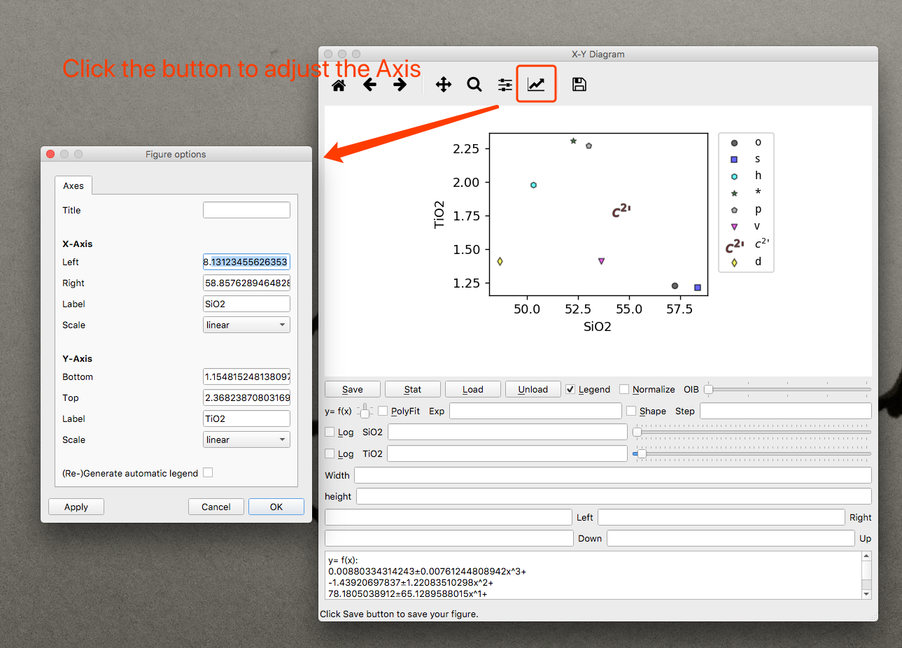
Adjusting Axises of Figure
All generated figures contain a menu bar on its top, which can be used to adjust the axises and title.
As shown in the picture below:
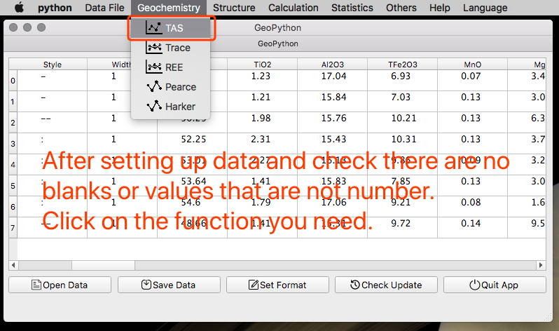
Click the Function you need
After setting up, you can just click to use the function you need.
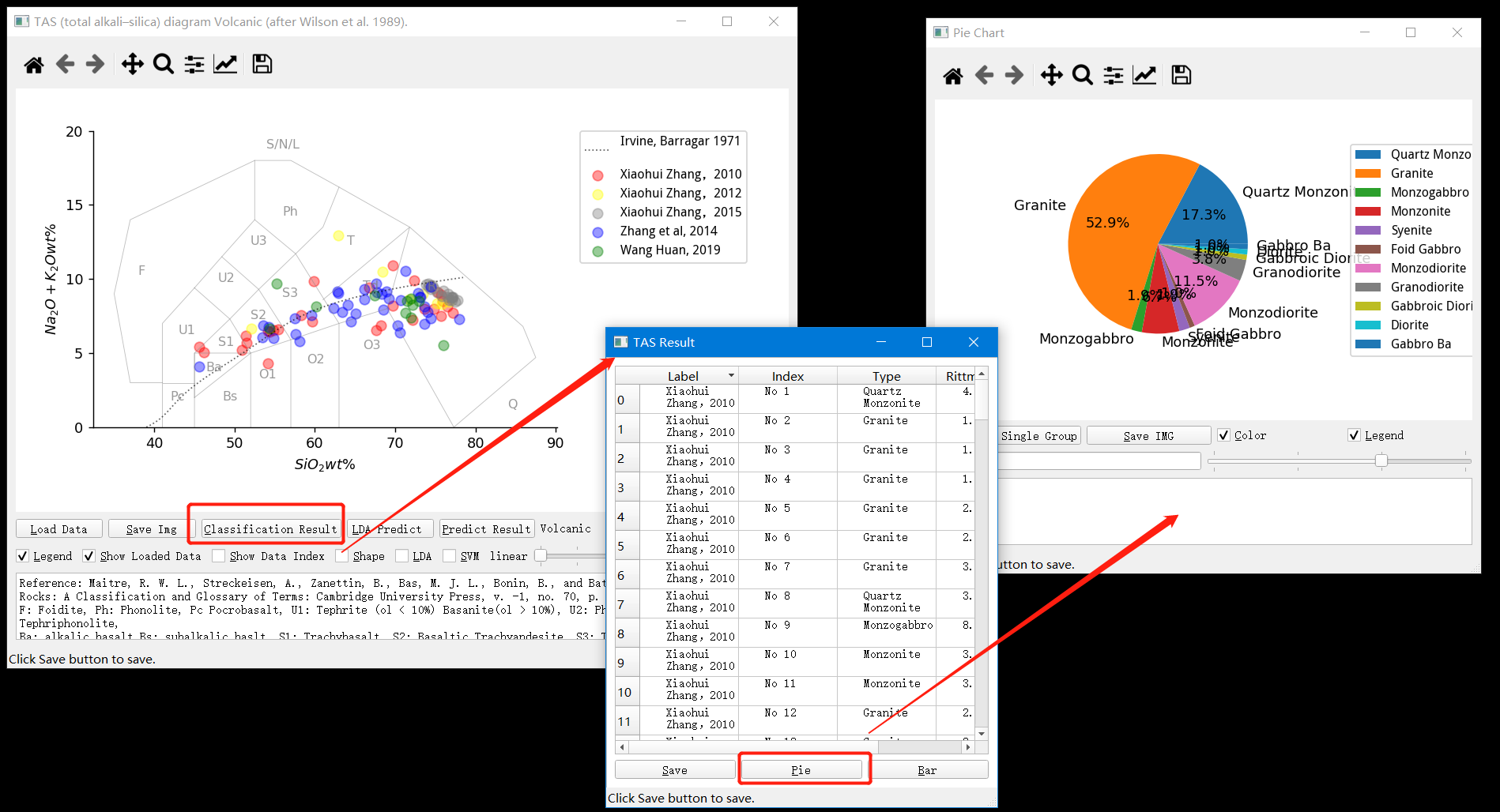
TAS/REE/Trace Elements
These functions are quite commonly used and the details are shown as the picture below.

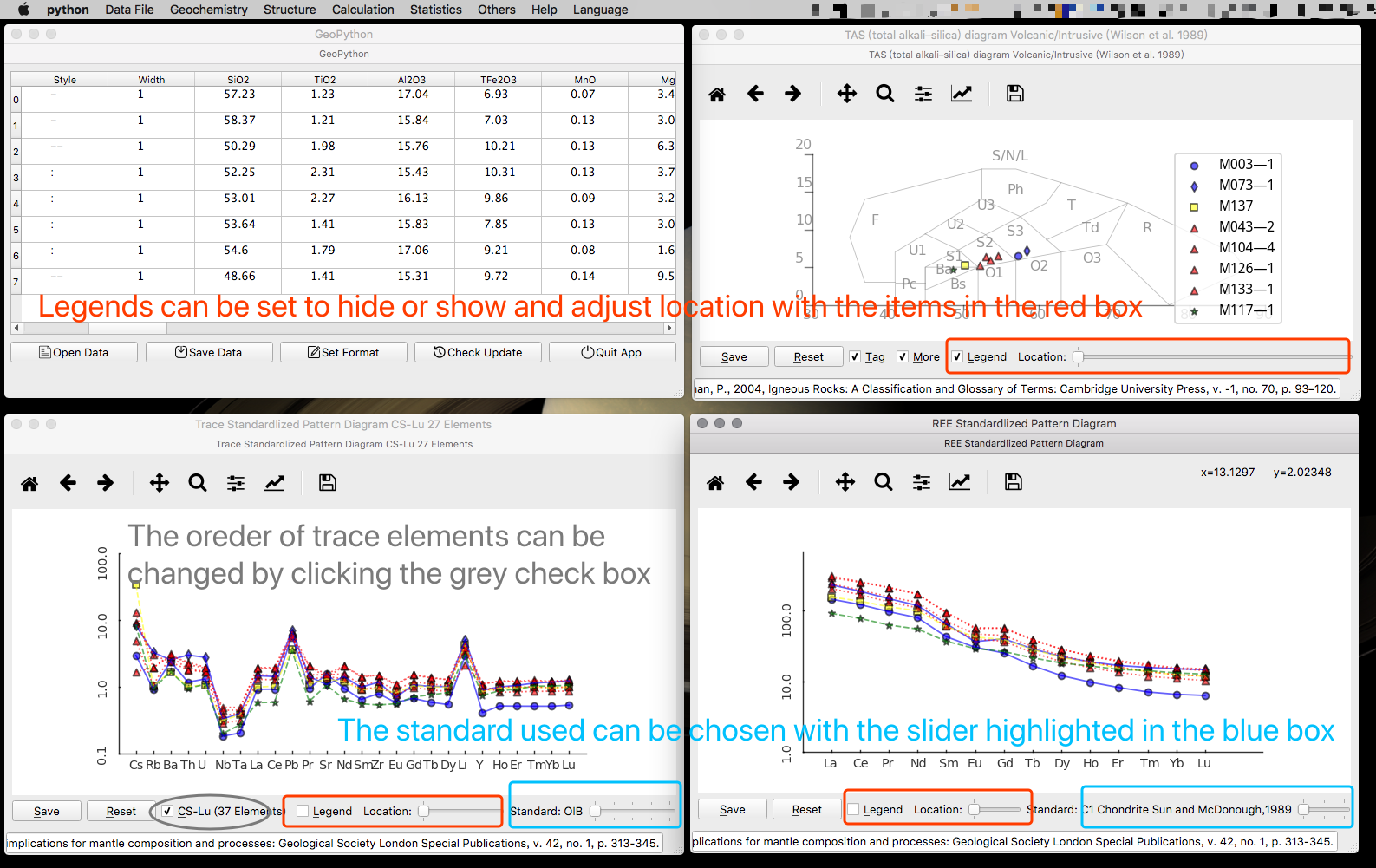
Click on the button shown in the picture below to get the classification results. On the table view image, click on the Pie button to generate the Pie chart of the results.
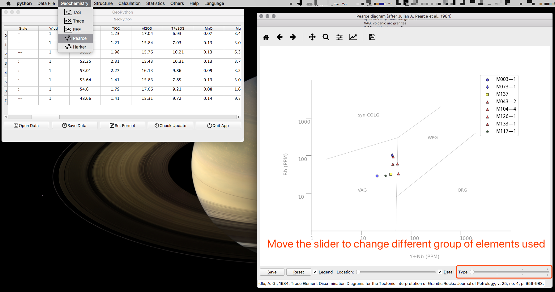
Pearce Diagram
Pearce Diagram just use some trace elements and is also quite easy to know how to use.
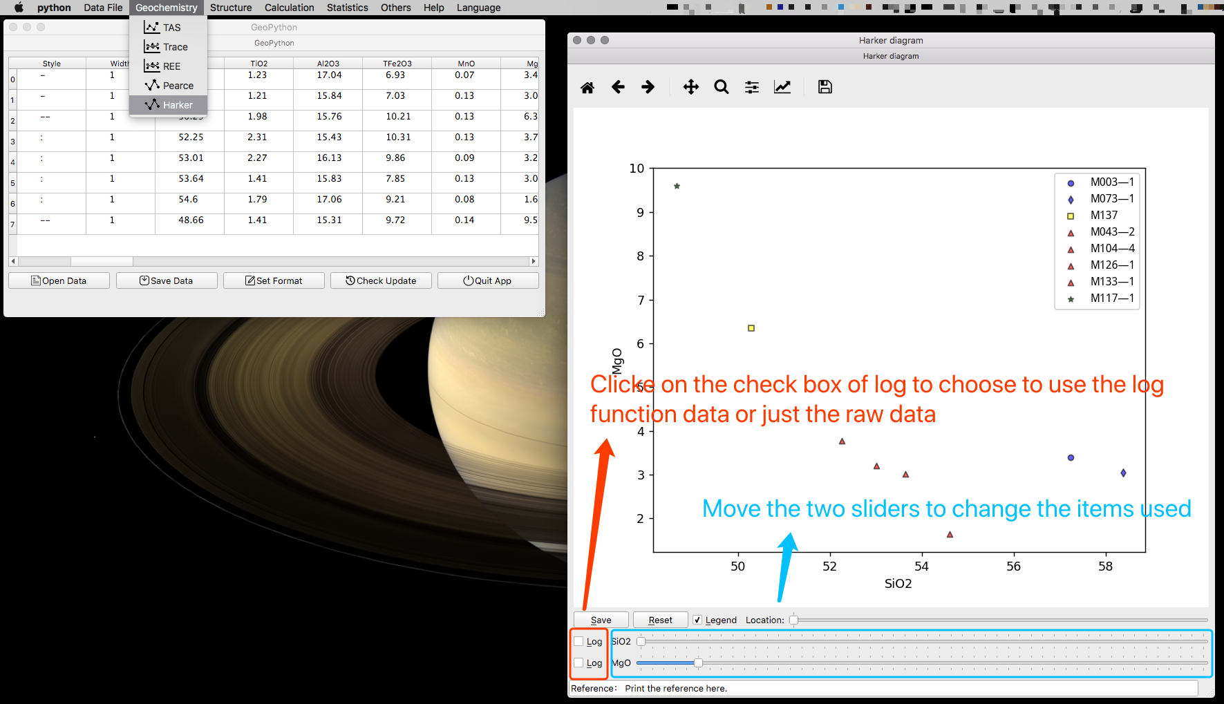
Harker Diagram
Harker Diagram is a little bit complicated. Both the X and Y items used for the picture can be selectable by the slider.
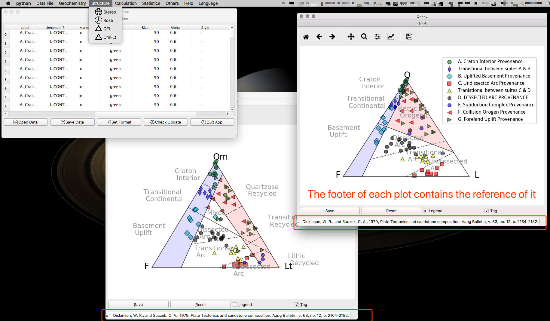
QFL and QmFLt
These two diagrams are very easy. But you must find the right data file used for them to import.
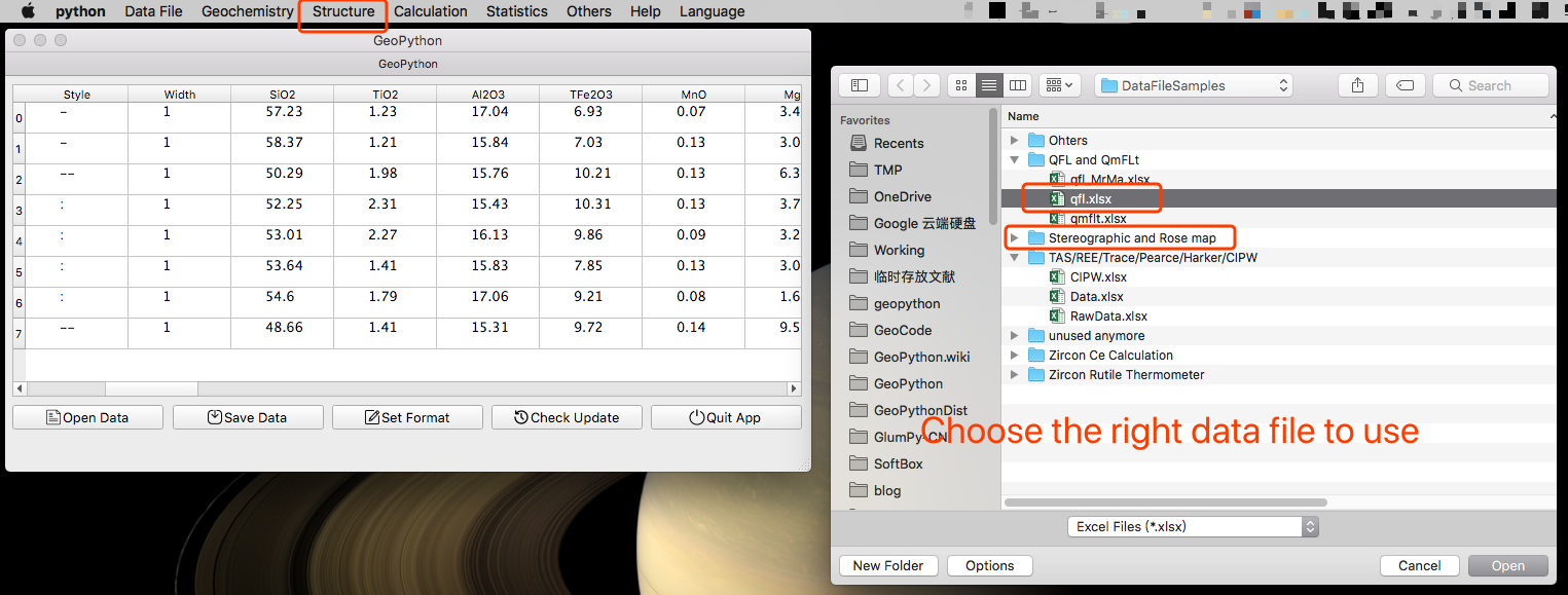
Remind to set up data, then you can run these two functions.
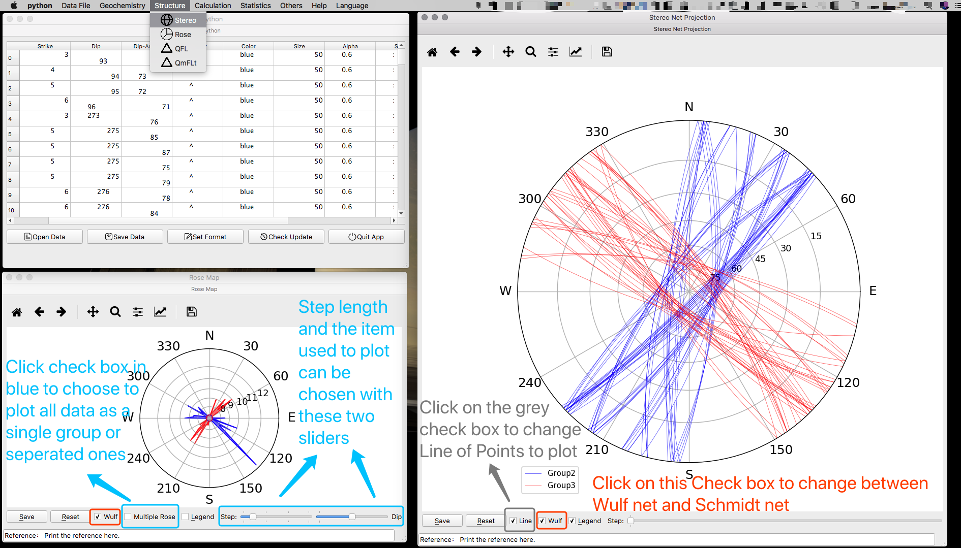
Stereographic Projection and Rose Map
Wulf or Schmidt Net can be chosen, and so is to use Lines or Points on the generated diagram. In the Rose Map function, all data in one data files can be treated as a single group of data to draw Rose Map, and can also be treated as seperated teams to compare the Rose Map from each other. The step of the Rose Map can be set by slider. And so does the items chosen to use in the Rose Map. Dip/Dip-Angle/Strike are all available.
Notice that the first Letters must be in UPPER case.
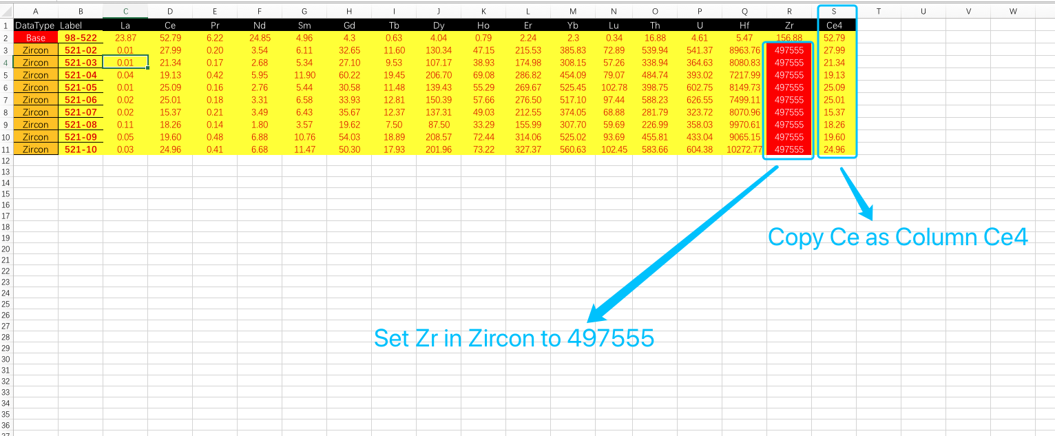
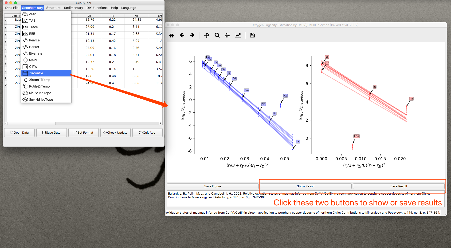
Zircon Ce4/3 Ratio Calculation
The data file used here is quite complicated. Please follow the guidance shown in the picture below.
Alarm! This function has been totally rewritten and the old Data File for the older version can not be used directly to the new version function! Please Download the latest Data File Templates from https://github.com/GeoPyTool/GeoPyTool/blob/master/DataFileSamples/Zircon%20Ce%20Calculation/ZirconCe.xlsx .
In the template data file for this calculation, the row with the Base symbol needs to be filled with the bulk REE data, and the zircon rows and Label column is where the REE data is input. The Zr value for zircon should be set as the “constant” 497555. Please Delete all unused elements and only leave the data to fit and calculate!
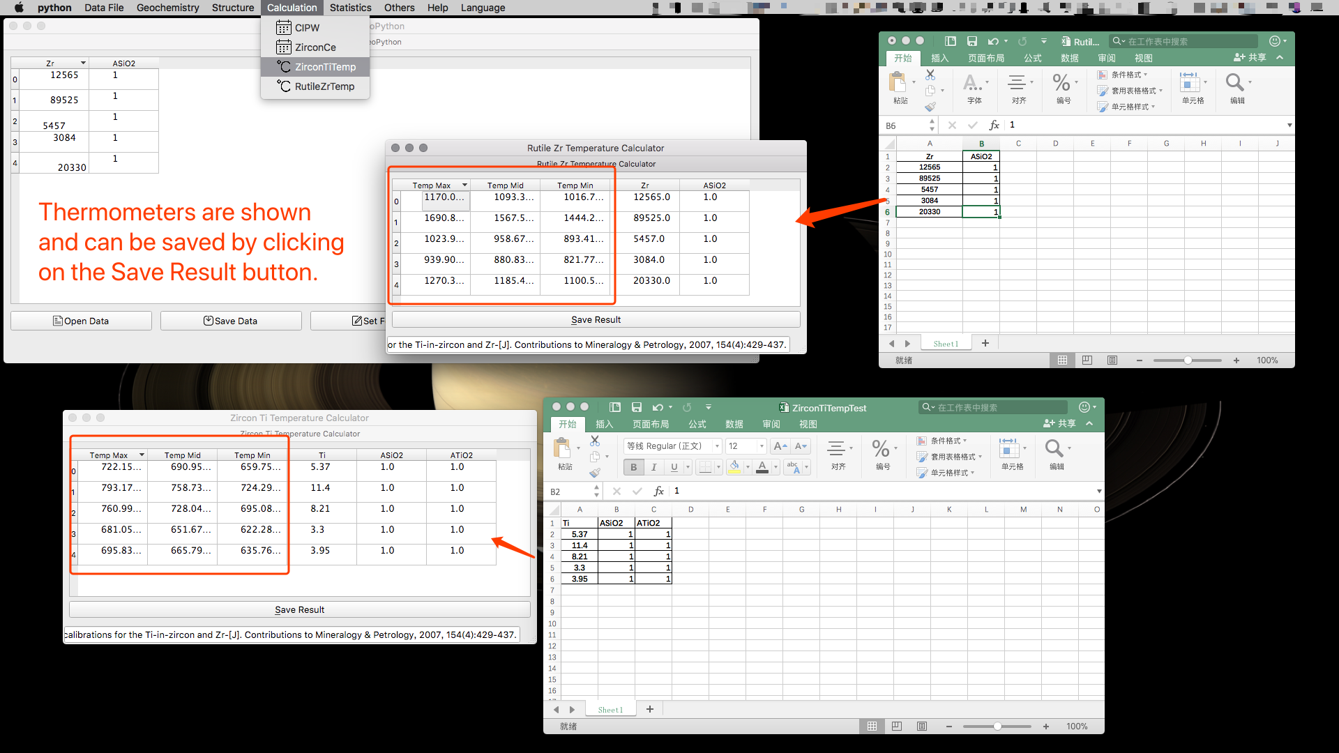
Zircon and Rutile Thermometer
These two function are super easy. Notice the ASiO2 and ATiO2 here are the Activity of these two components.
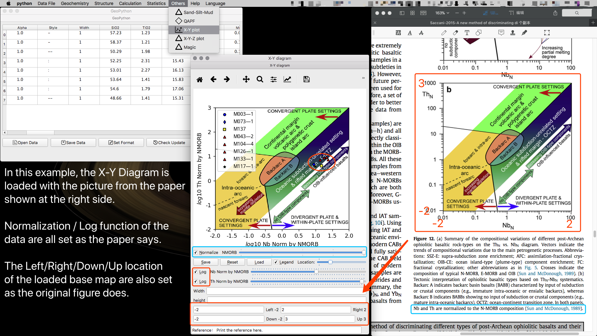
User Defined X-Y diagram
This function allows users to load any picture from any articles as a base map to plot on.
But you must understand the original plot first and know the mathematical setting of it. So you can set up the right format in your plot.
For example, as the picture below shown, the original diagram used Nb and Th, normalized by N-MORB(Sun and McDonough 1989), and then used the Log function of these two items. So we do the same setting up as shown by the picture. The Left/Right/Down/Up limit of the original diagram are 0.01/100/0.01/1000, so we need to use the Log function and find out that we should set the Left/Right/Down/Up limit to be -2/2/-2/3. If you can not understand why, please take a rest and good bye.

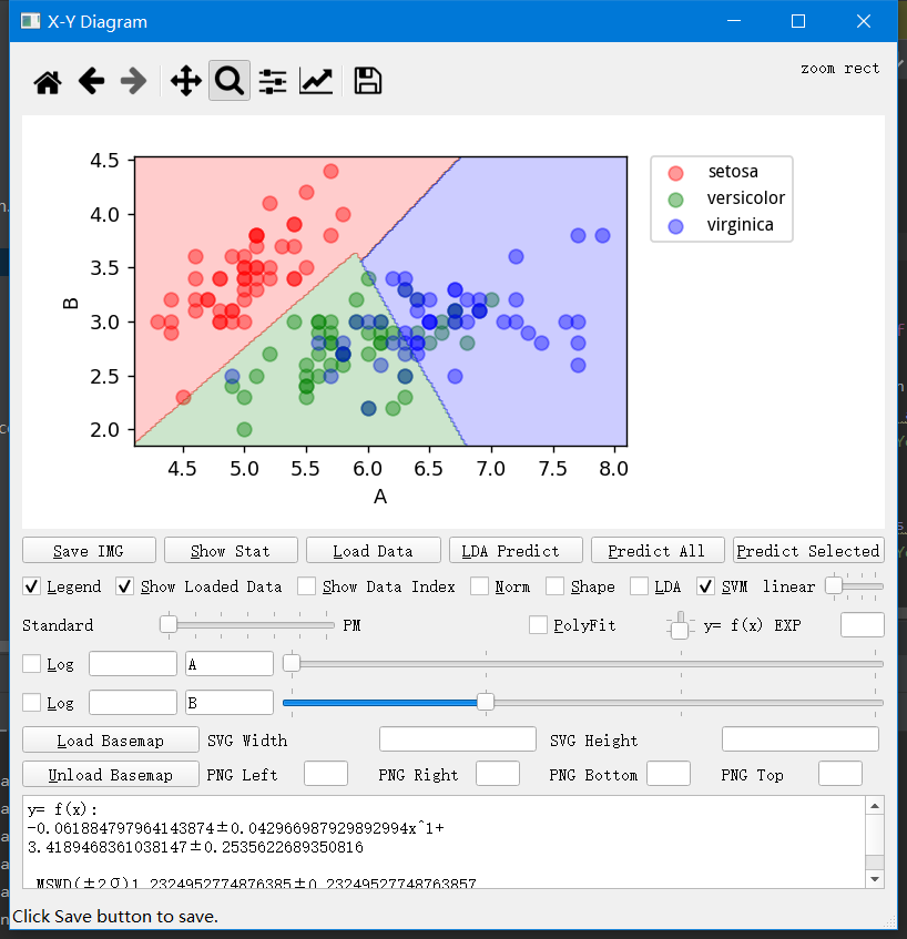
Open a data and format in the main interface, then run X-Y plot to get the x-y diagram. The log checkboxes control whether you would log the data, the editable boxes follow log checkboxes are to input timer of select data feature. The other editable boxes and the sliders next by both control the data features you choose to plot on the diagram. For example, in the picture below, It is just A and B directly used as features. Click on LDA checkbox to show the LDA boundaries. Or Click on SVM checkbox to show the SVM boundaries. Then click Load Data to load unclassified data samples to make prediction. If you only used the plotted features, for example A and B shown in the picture below, the predicted result of LDA can be seen and saved by clicking "LDA Predict" button, SVM prediction result can be got by clicking "Predict Selected". If you want use all features to run the SVM to predict, click on "Predict All" button. These buttons work the same way in other similar plots, shown as the pictures below.
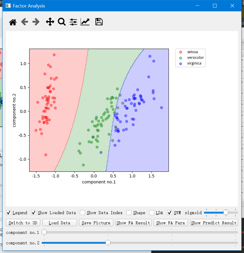
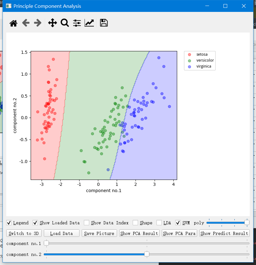
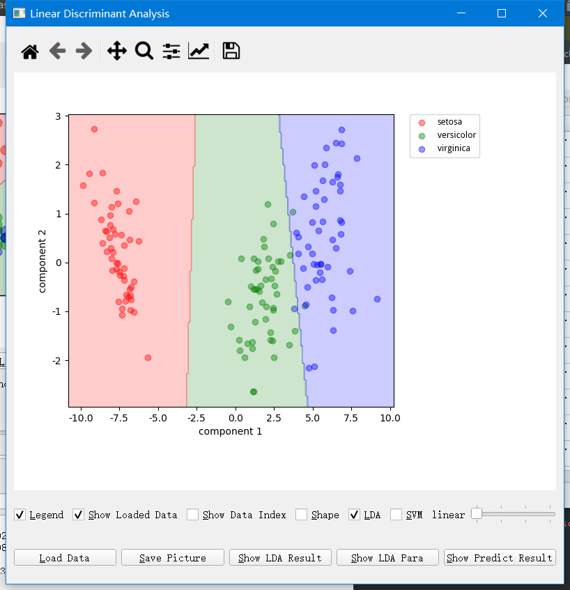
Standa alone FA/PCA/LDA functions are similar to the X-Y function.
User Defined X-Y-Z diagram
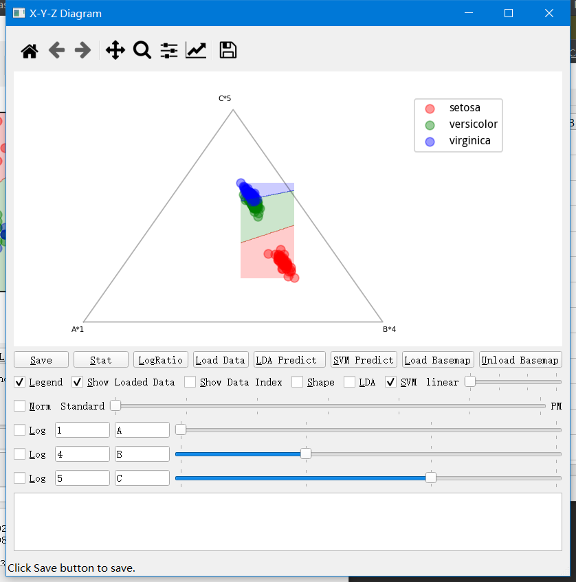
Open a data and format in the main interface, then run X-Y-Y plot to get the x-y-y diagram. The log checkboxes control whether you would log the data, the editable boxes follow log checkboxes are to input timer of select data feature. The other editable boxes and the sliders next by both control the data features you choose to plot on the diagram. For example, in the picture below, It is 1A, 4B, and 5*C used as features. Click on LDA checkbox to show the LDA boundaries. Or Click on SVM checkbox to show the SVM boundaries. Then click Load Data to load unclassified data samples to make prediction.
Additional functions
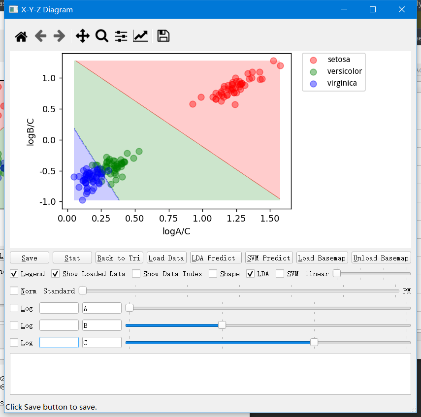
Click on the "LogRatio" buttion will transfer the triangular plot into a normal X-Y plot, which is much elegant both mathematically and practically.
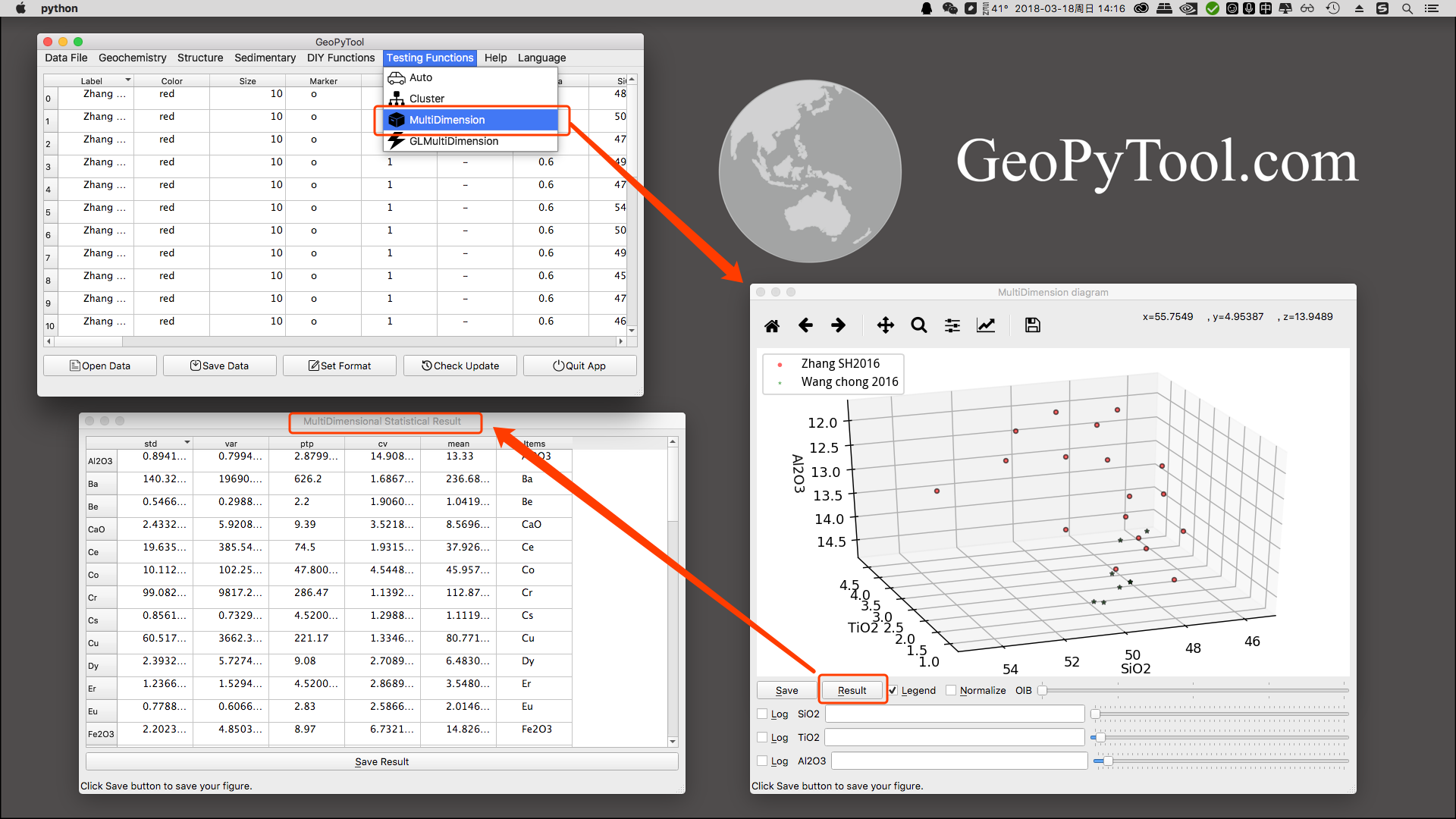
3D and Statistics
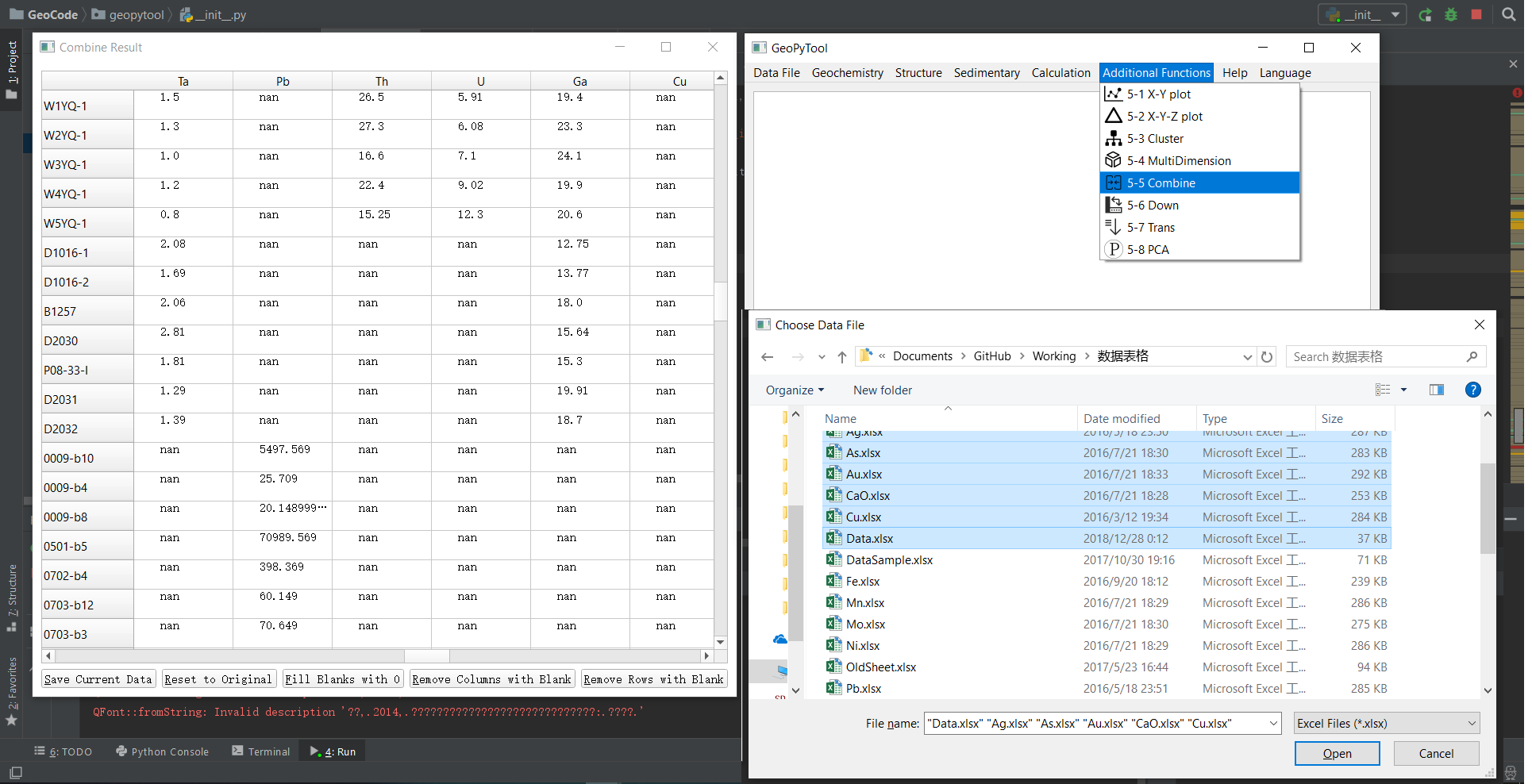
Combine Multiple Excel data files into One Excel file
Cluster

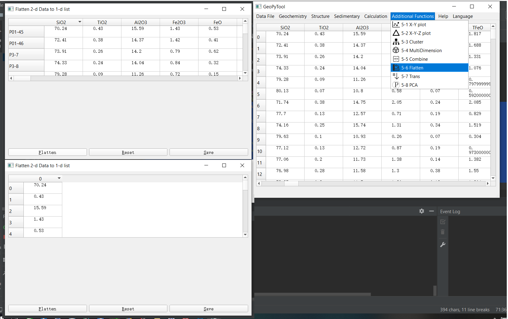
Flatten a 2-d data files into 1-d array
Data Transformation: Transposition/ Center Trans/ Standard Trans / Log Trans
![]()
Factor Analysis (FA) and Principal Component Analysis (PCA)
